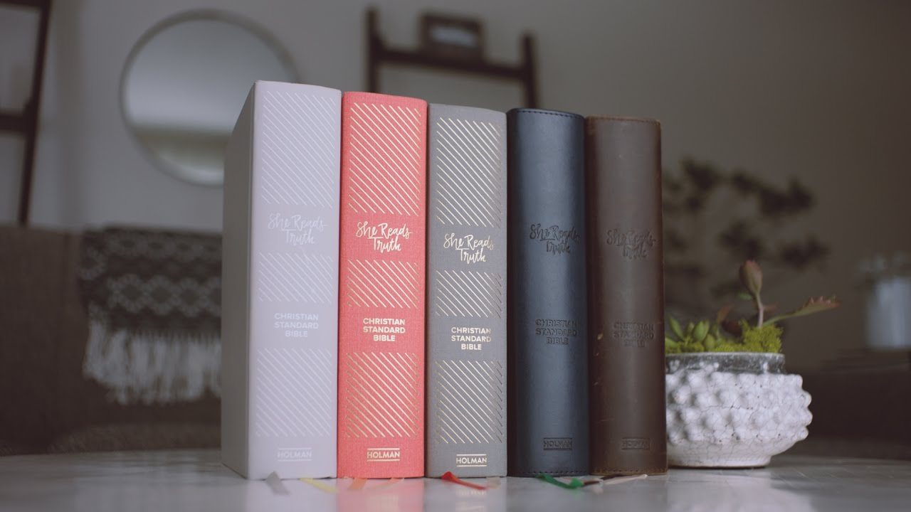
I’ve been a She Reads Truth fan since nearly the beginning. I’ve written a few posts about their studies before.
I didn’t grow up in church and didn’t really know how to engage in scripture– SRT helped me by providing thoughtful devotions and corresponding scripture to study– and they did so in a way that was beautiful and thoughtful. I was a part of their launch team for the SRT Book, and have participated in countless studies by them for over 3 years.
So when I heard about the SRT Bible, I was ECSTATIC. It looked stunning from the outside, and I knew it would be as beautiful from the inside too. And I was not disappointed!
I was equally excited when the B&H Bloggers program had one on their site up for review purposes. I hadn’t had the money to splurge on an SRT Bible just yet, so it came at a great time!
I actually missed the cutoff for this review copy, due to a technical error, but the people at B&H are so nice they sent me one to review anyway! (shout out to Andy for being awesome!).
So here are my thoughts:
First off, it is gorgeous looking. Isn’t it?! I love this color (I was thinking I’d get the grey one per the review copy, so was over the moon to receive the poppy colored one!! Squeal!!)
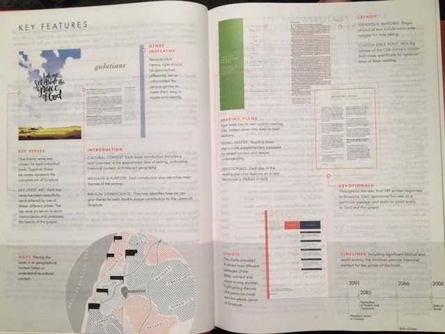
- key features–maps, charts, etc
Now honestly, does scripture and the Bible have to LOOK pretty for us to engage with it? Nope. But doesn’t the beautiful word of God deserve to look as beautiful as the words within it are? I’d say yes. Jess Connolly made this point in one of our Dance Stand Run launch team live chats about her book– the cover is stunning, but it doesn’t have to be– but God deserves our best. He deserves beauty! And so does His word, to extend her example. The Bible is inherently beautiful, but making it look as beautiful outside as it is inside glorifies God all the more, in my opinion.
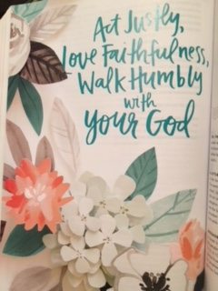
And truthfully, it makes using this Bible all the more engaging: looking at the beautiful scripture pages at the beginning of each book, studying the stunning maps, charts, and timelines that are as aesthetically pleasing as they are a valuable resource in learning about the whens and wheres of the Christian world. Especially charts. I’m a chart/worksheet kind of girl.
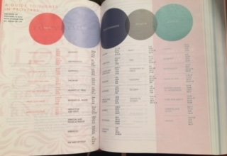
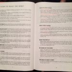
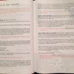
I get bored fairly easily reading the Bible, if I’m being honest. So making it captivating with design, helpful tools to understand it better, and devotions to bring it to life help me so much. Case in point: the “How to read the Bible” and “This is the Gospel articles at front of Bible– super helpful for beginners. The “How to read the Bible” article helped me immensely, honestly.
An aside: Now, if anyone knows me well, they know I am one of the messiest humans on earth. My books are typically very loved looking (meaning they’re worn out, dog-eared and usually falling apart by the end of the reading from being in my purse) because of this. I kind of love that about my books, because it shows you how much I love my books (which is a lot).
I’m not letting this happen with my SRT Bible. I love it by keeping it nice; I don’t want it to be dog-eared and messy. I don’t let myself have food/drink around it, it stays in its box when I’m not using it, I have a special place it goes with my other Bibles/journals/study tools that I put it back in EVERY night. It’s worth it to keep it pristine to me. I write in the margins w/ a sharpie pen, but haven’t highlighted due to the page thinness (more on that later). Back to the review!
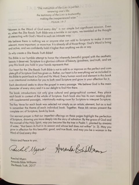
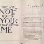
I appreciate the different Bible study plans (pic on left)– both one for digging into each book of the Bible, and one for reading the Bible as a whole.I haven’t used one yet because I’m doing a study on 1&2 Samuel right now (with SRT of course, duh) but will definitely use one in the future. The book introductions (pic on right) are thorough and useful, a great tool as I engage in books I don’t know much about.
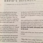
I love all the devotions I’ve read so far, though I wish they hadn’t been ones that were used on the SRT website already. (I doubt they all are, but the ones I’ve read so far I’ve read in previous studies!) Eg: I’m doing the Life of David study, and two of the devos in the Bible were also the study on the website. I also wish they’d write who wrote what on the devotion instead of having a directory of names in the back.
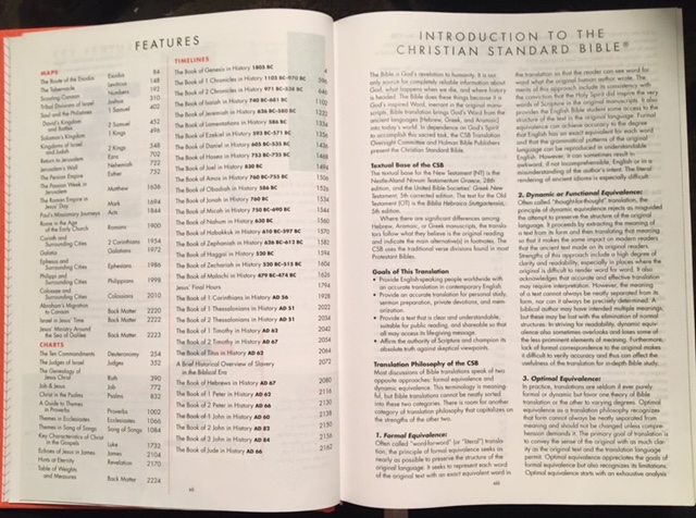
As for the Bible’s version, it’s a new one to me-the Christian Standard Bible (CSB). I like this version! This is my first time using it. It’s very clear and easy to understand. The footnotes are a bit confusing though– I know there’s a key at the beginning of the Bible, but I wish they were easier to engage with and understand what they mean in relation to the scripture. For my study Bible, I use NLT, so this is a great companion to that (and the occasional reading of The Message for a fresh take on the wording).
The wide margins are great, especially as a Bible journaler– though I don’t intend on doing much artsy journaling in this Bible. I like using the margins to write out scriptures that stand out as I read them, or notes from my study.
I’ve read a lot of complaints on the thin pages– and I won’t lie, they are thin. I’m afraid if I move through them quickly I’ll rip one! But as far as the thinness in relation to reading the scripture, it doesn’t bother me too much. I can read it just fine. The only pages that it bothers me is on the pages where there’s a devotional on one side, and scripture on the other– the design of the devotional pages does make it a little harder to read the scripture. I wish they’d put devotionals on both sides of the same page to avoid this problem, but it’s more of a slight annoyance than anything else.
Example:
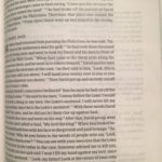
What it looks like when I write a long passage (front and back of same page):
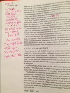
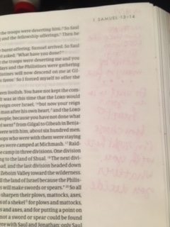
I use a sharpie pen in my SRT Bible and can see some shading on the back, but no major bleedthrough has occurred from my writing.
What the pages with devotionals on one side, scripture on the other look like:
See- because the outline/ design of the devotionals are different from the scripture pages, it looks wonky. Again, it’s merely an annoyance, not something to write home about.
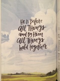
Overall, I LOVE this Bible. It’s beautiful to look at, easy to read and understand, and thought-provoking in the additional details it provides. I’m a fan of most everything the SRT ladies put out there, but am especially proud of this product by them.
Proud to be a member of the SRT Community, and grateful for the way they use their beautiful designs and thoughtful studies to bring women into the word of God every day. I hope this Bible does that job well for women around the world– it’s doing so for me!
There’s a more succinct version of this review on Amazon and Goodreads.
Happy reading!




[…] shared my review of the SRT Bible last weekend. If you don’t have one already, you definitely should put it on […]
[…] wrote an extensive review here, but I’ll share again: A beautiful Bible inside and out, with scripture prints, maps, and […]